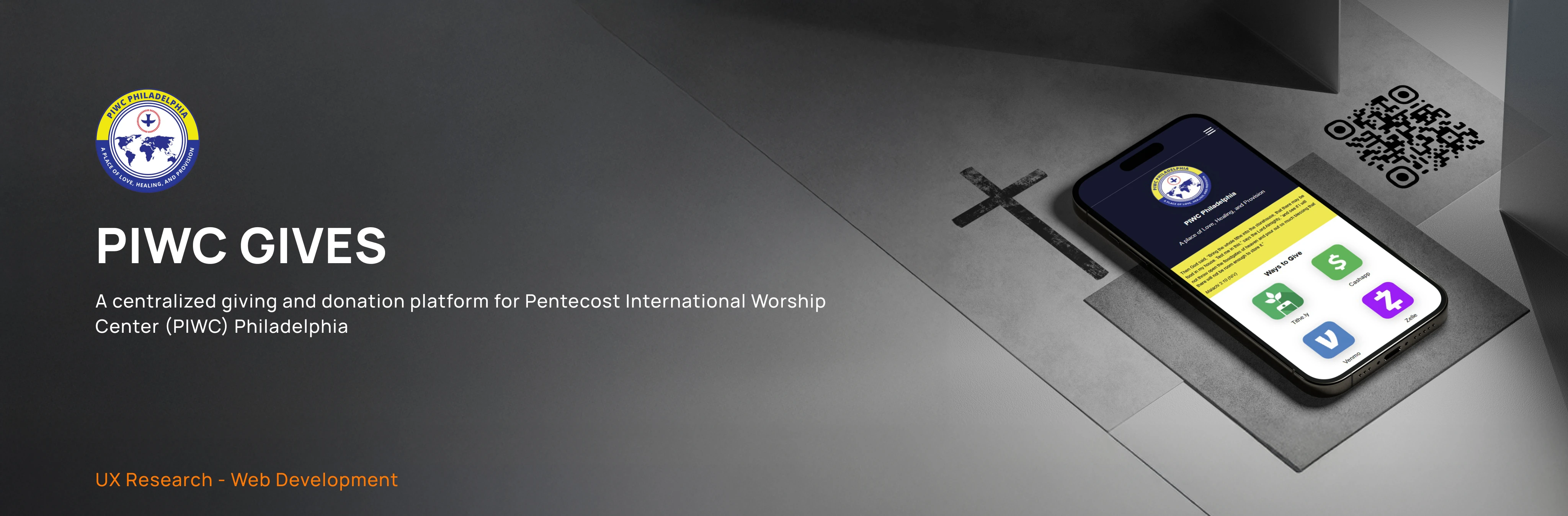
PIWC Gives
Overview
PIWC Gives is a centralized giving platform designed to simplify how members of Pentecost International Worship Center (PIWC) Philadelphia, give offerings, tithes, and donations. Prior to this project, giving options were scattered across multiple platforms, creating confusion and friction especially for new members and online viewers.
This project resulted in a mobile-first, easy-to-navigate website that clearly presents all available giving methods in one place, reduces the time it takes to give. By combining user research, UX best practices, and front-end development, PIWC Gives transforms church giving into a simplified and meaningful digital experience.


Timeline
Jan 2025 - March 2025
Role
Solo Designer & developer
Tools
HTML, CSS
Context and Challenge
Background
Pentecost International Worship Center (PIWC) serves a diverse, growing congregation with both in-person and online members. As digital engagement increased, so did the need for a modern, accessible way to support church giving beyond physical services.
The Problem
Church members used multiple platforms to give—Cash App, Zelle, PayPal, and in-person offerings—but there was no single place explaining these options clearly. This led to:
Confusion on other options of giving
Friction for first-time visitors and online attendees
Missed opportunities to communicate the impact of giving
Goals
The success of PIWC Gives was defined by the following goals:
1
Create a centralized hub for all giving methods.
2
Reduce the time it takes to complete a donation.
3
Design a mobile-first experience.
4
Communicate the purpose and impact of giving
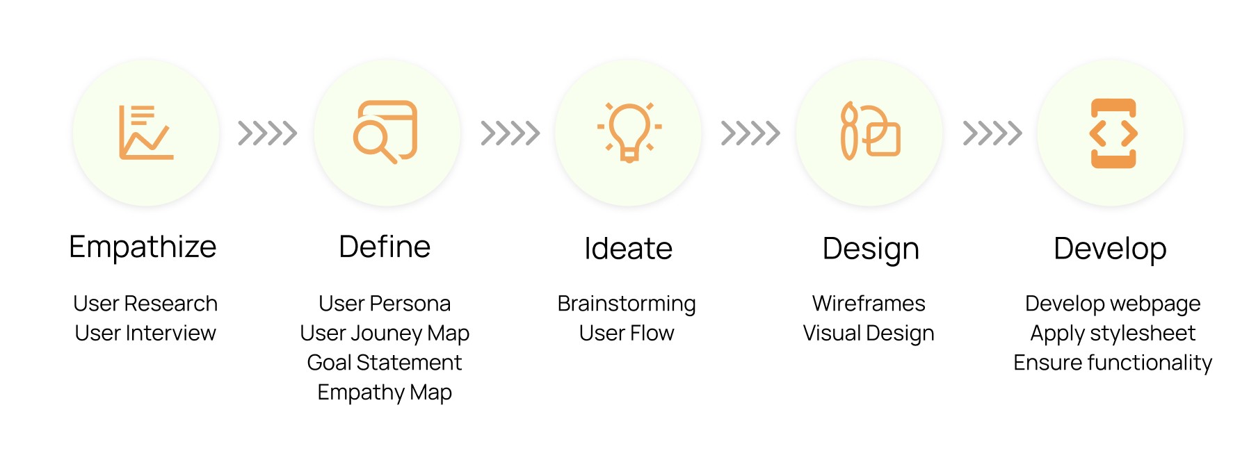
Design Process and Insight
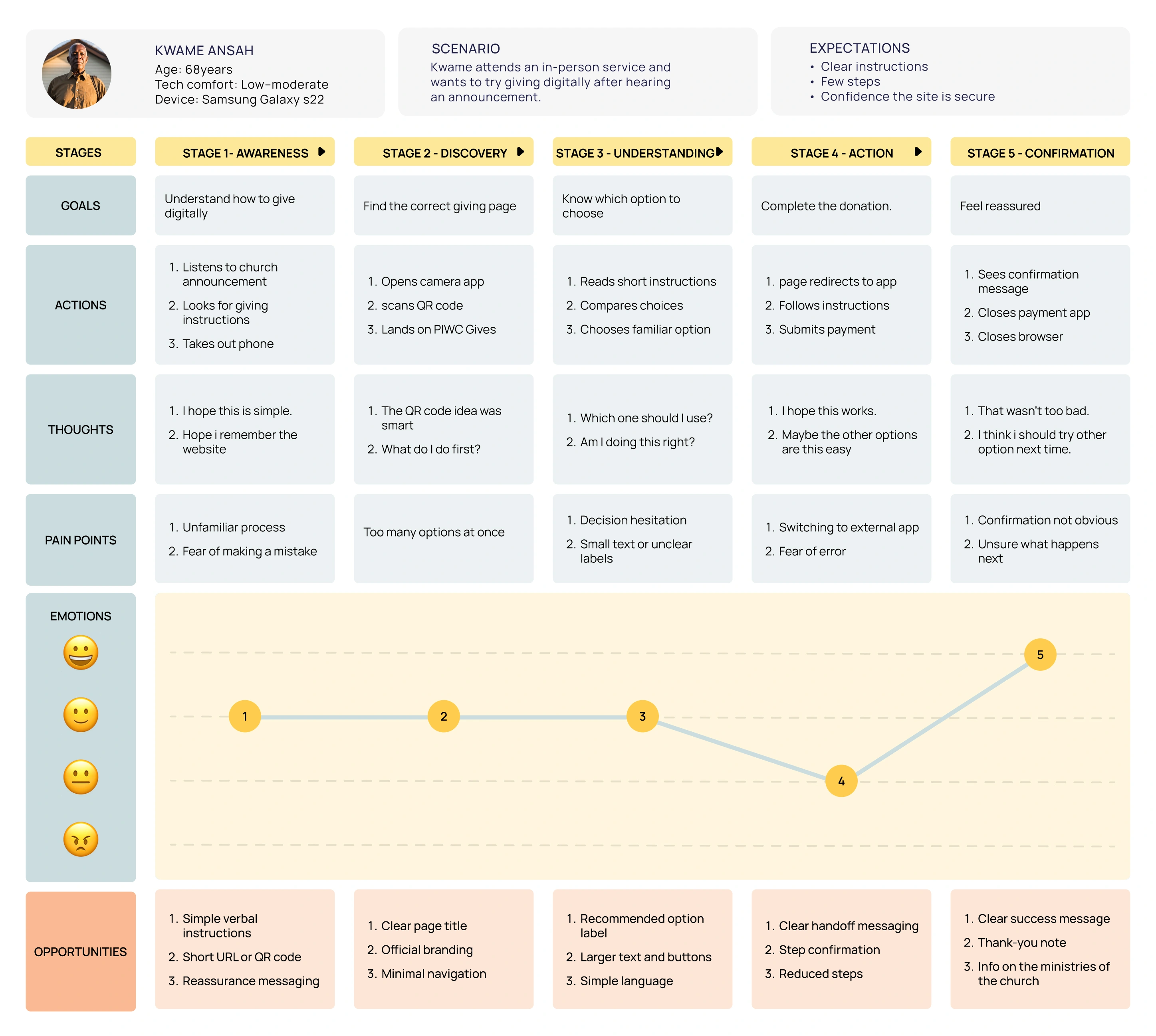
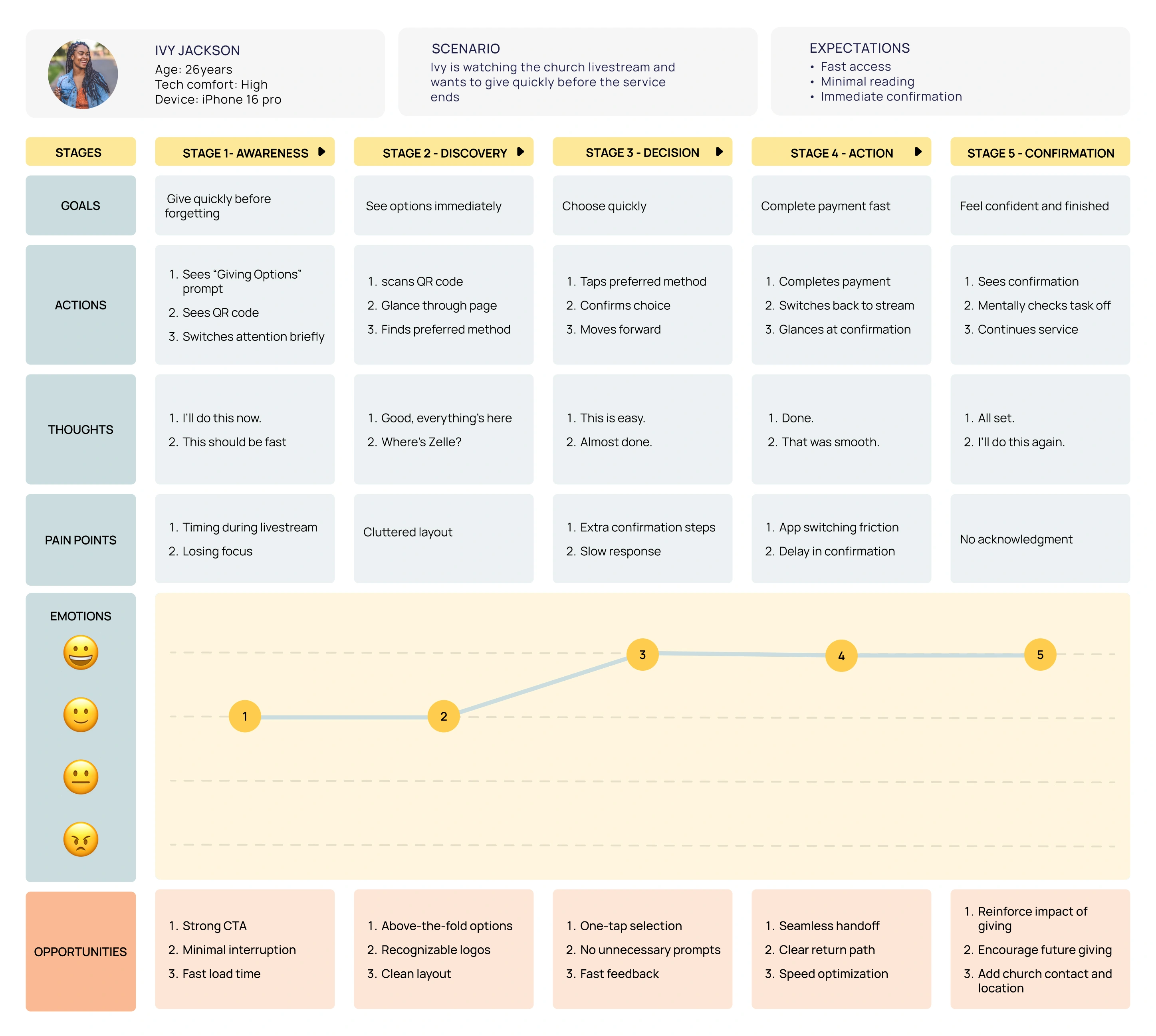
The design was guided by a human-centered UX research process focused on understanding how church members currently give, where friction exists, and what would make digital giving feel easier and create better experience. Rather than starting with visual design, the project began by studying real behaviors, motivations, and pain points.
User Research and Interview
To ground the project in real user needs, informal interviews were conducted with church members. These conversations focused on current giving habits, frustrations, and expectations.
In addition to interviews, Fly-on-the-Wall observation was used to understand real-world behavior during giving moments. Members were observed during in-person services and online worship experiences.
The interview and observations revealed that:
Different members preferred different payment platforms
Many relied on saved screenshots or previous links
Giving was often rushed and done on mobile devices
The older generation find it confusing giving on mobile devices.
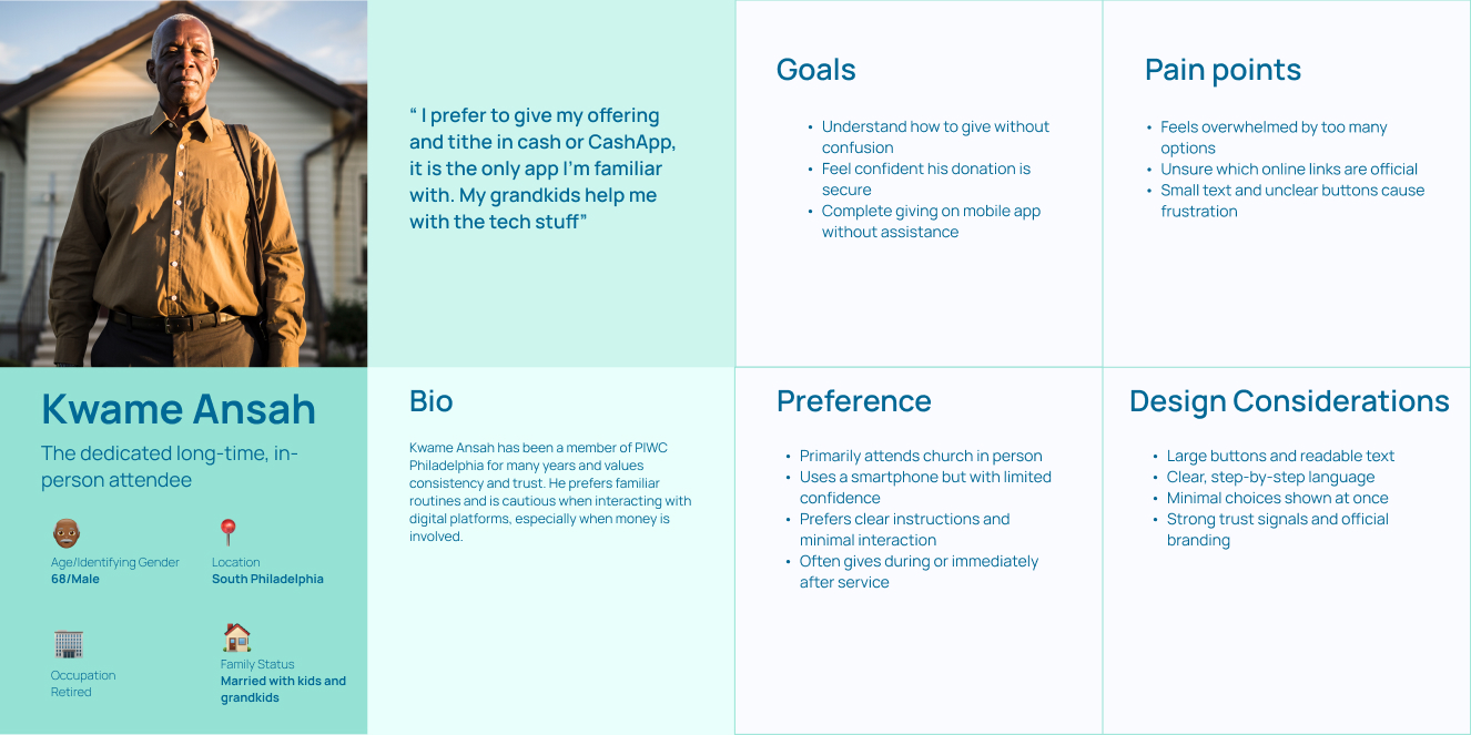
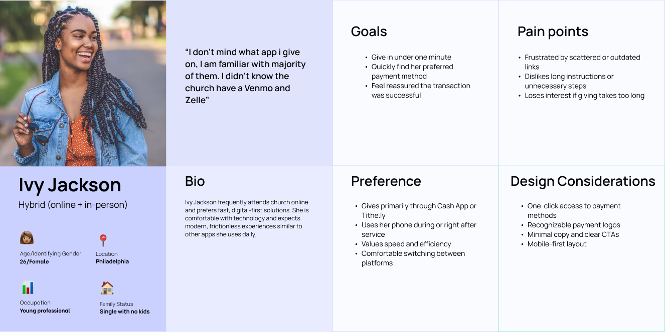
User Personas
To ensure PIWC Gives served users across age groups and comfort levels with technology, two primary personas were created. These personas represent distinct needs, behaviors, and pain points that influenced key design decisions.
User Persona - Kwame Ansah
User Persona - Ivy Jackson
User Journey Maps
Separate journey maps were created to understand how each persona experiences the giving process and where friction occurs.
Kwame Ansah's Journey map
Ivy Jackson's Journey map
User Flow
The final user flow was intentionally short and direct:
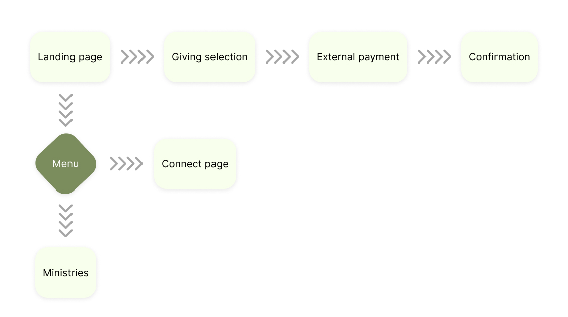
By reducing unnecessary steps and keeping all options visible, the experience minimized cognitive load and supported fast decision-making. I also added a Connect page and Ministries page to the user flow to give some depth into the church.
Wireframes and User Testing
Wireframes were created to focus on layout, content hierarchy, and ease of use. The goal was to clearly present all giving options on a single page without overwhelming users or any distractions from the other pages.
Key wireframe decisions:
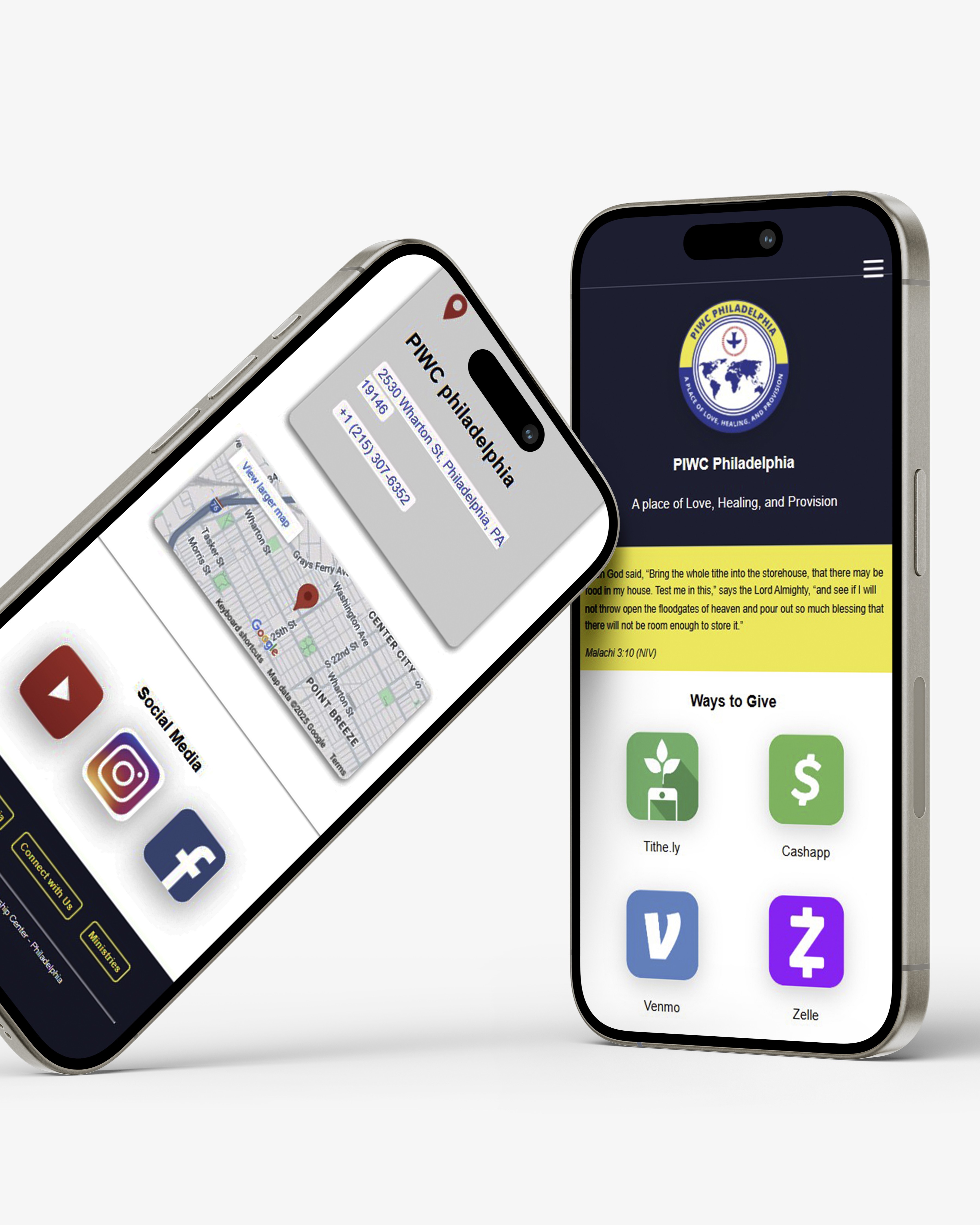
“Ways to Give” placed above the fold
Giving options grouped into clear, clickable cards
Minimal navigation and short instructional copy
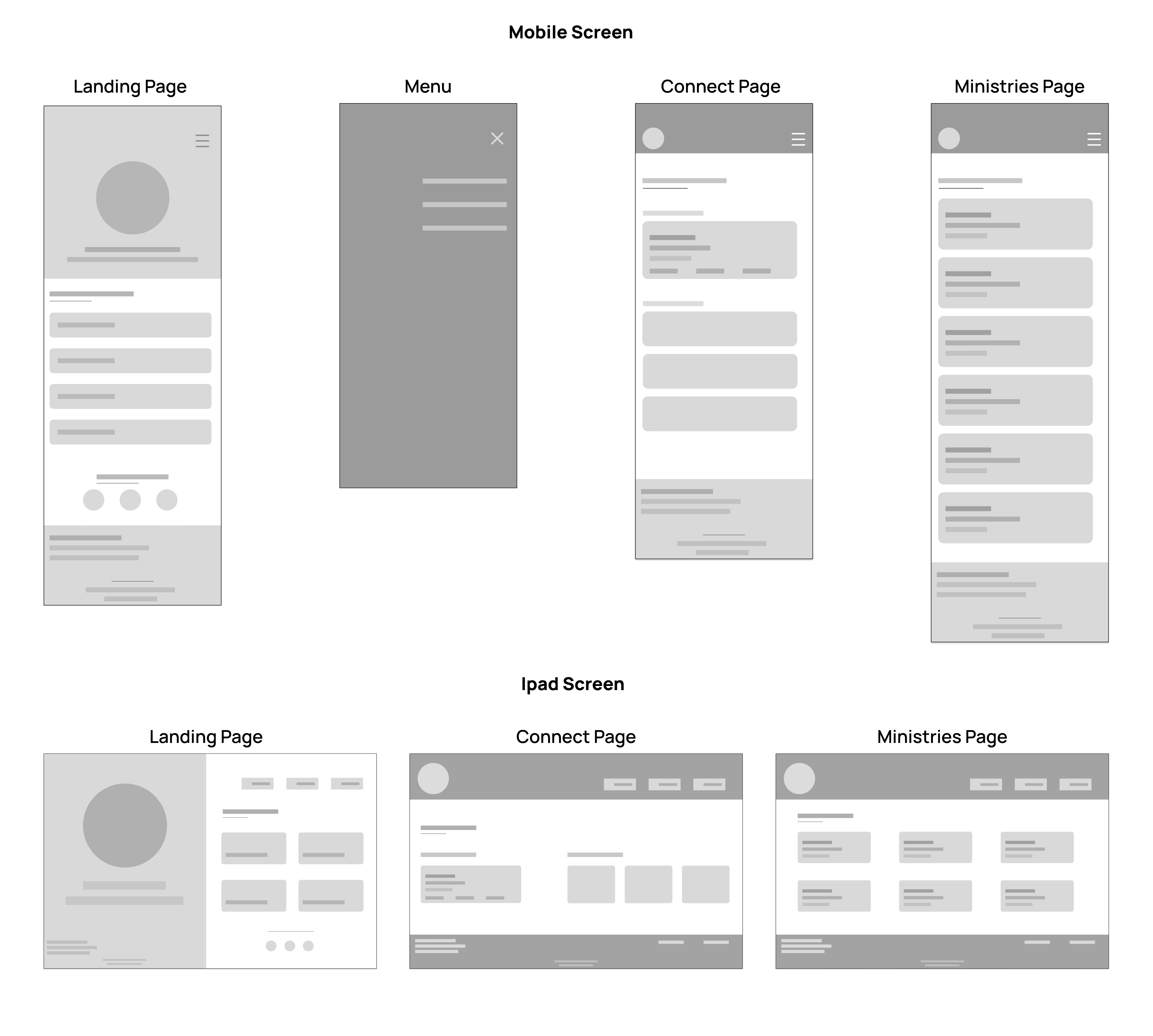
Light user testing was done by walking church members through the wireframes. Feedback showed that users preferred seeing all options at once. They responded better to clear labels and familiar payment logos instead of containers with the logo and text. Based on this, spacing was improved and copy was simplified to reduce friction.
Web Development and Deployment
Once the design direction was decided, I jumped into building a functional, scalable, and user-friendly platform.
Setup & Frameworks:
The site was built using HTML and CSS and all code was managed through GitHub, allowing for version tracking. The site was deployed on Vercel to ensure updates were live quickly.
HTML:
I made a clear semantic structure and added logos and CTA buttons. Each giving method was represented as a card component.
CSS:
Considering this as a mobile-first approach, i relied on flexbox and CSS grid for layout. I made custom variables for consistency and added media queries for responsiveness for both mobile and larger screens.
Testing & QA:
After the site was developed, I did a browser testing across Chrome, Safari, and Firefox and also made sure the QR code was functional. I also did a final user testing with a small group of church members to confirm clarity of instructions.
Results
PIWC Gives successfully addressed the original challenge of fragmented and unclear giving options by providing a single, centralized platform.
Key outcomes:
Simplified the giving process into a one-page experience
Reduced confusion for both new and returning church members
Improved accessibility for mobile and older users
Received positive feedback from church members and leadership
Overall, the project met its primary goal of making church giving faster, clearer, and more approachable.
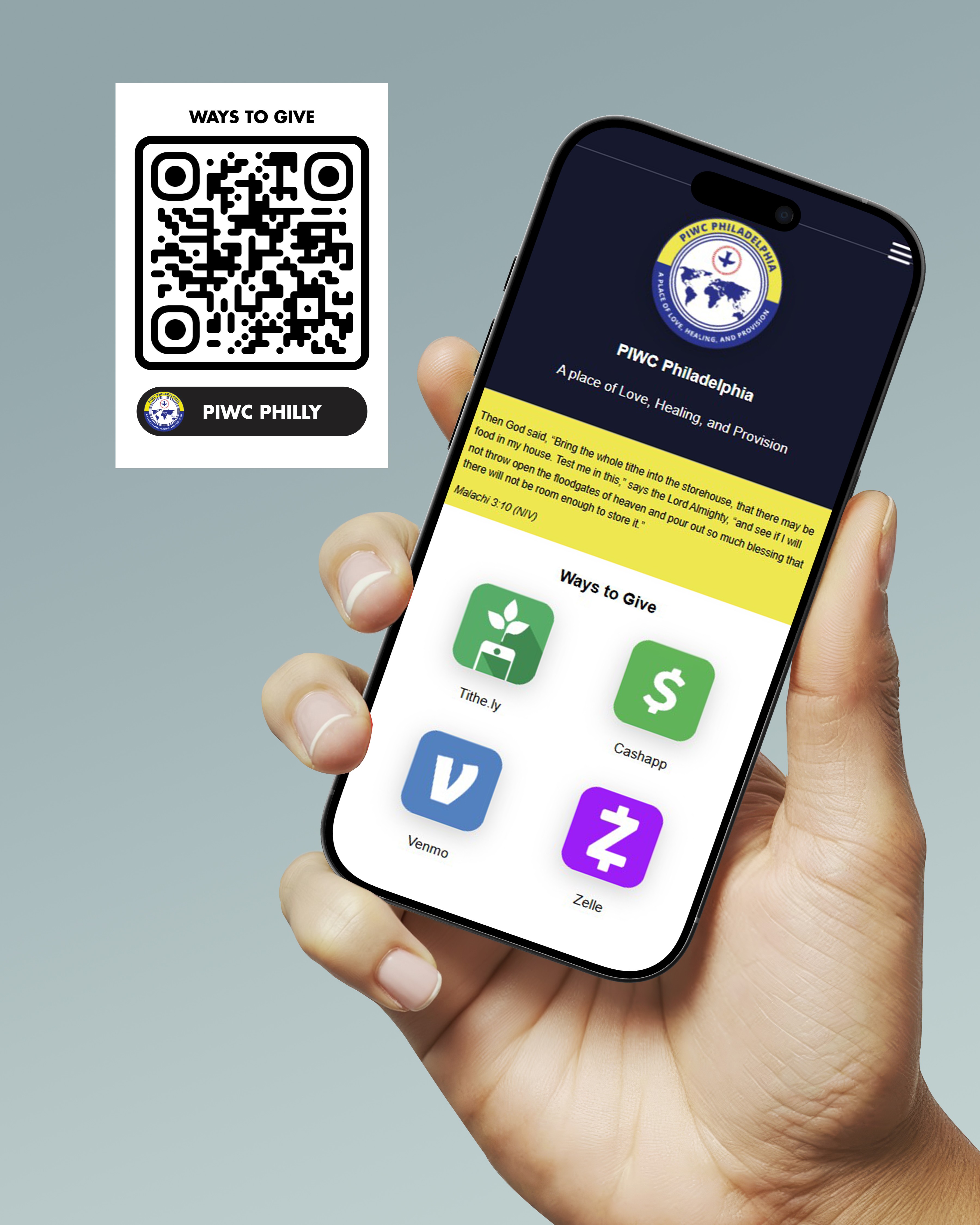
Scan QR code below to visit site
or click link below (Mobile screen recommended)


